The opportunity to feast our eyes on a little colour while we enjoy our favourite beverage does not go amiss and whatever some may say about letting the beer speak for itself breweries must, of course, be able to differentiate themselves from their competition.
Given the number of breweries vying for our attention it is no surprise that long before the beer hits the shelves, chillers and pumps, a lot of thought has been given to bringing the character of the brewery to bear on a visual level and create strong associations within the minds of the beer drinker.
On a purely aesthetic level we’ve collected just a few of the standout moments where beer and art link up and create something truly special.
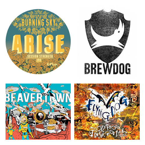
Burning Sky / Simon Gane
We lucky residents of Sussex have Firle-based Burning Sky to deliver our thirst from both the dusty summers and chill winter evenings by the fire. Burning Sky’s livery has been lovingly crafted by artist extraordinaire Simon Gane. We asked Simon about the design process; did the brewery give him free reign or was he guided by a mission statement or philosophy that sums up the brewery and their product?
“It’s funny, whilst I think the visuals do represent a mission statement, we seemed to arrive at them more organically than that. Eventually! They are a collaboration between Mark (Burning Sky’s owner) and myself, but also simply a natural culmination of our combined strengths and tastes. Things like mid-20th Century design and packaging, the illustrated elements to reflect the natural ingredients or countryside, and on some of the more recent labels and pump clips, the cut ‘n’ paste aesthetic you might associate with punk – which also inspires a number of the beer names themselves.”
“Whilst we have consistent design elements in the logo and lettering, we approach each new beer in its own right. I’ll draw a new illustration when time allows, and so on. In that way, the true branding is not in the similarities across the line, but in the differences. I think those personal touches and attention to detail certainly are a reflection of Burning Sky.”
With a huge portfolio of work including illustration for the They’re Not Like Us graphic novel series, you can see more of Simon’s deft pen and brush work on Instagram .
Beavertown Brewery / Nick Dwyer
Artist Nick Dwyer is a graduate of the University of the Arts in London, Europe’s largest specialist arts and design university and since 2014 has been Beavertown’s Creative Director and Designer. His unique and unmistakable style with darkly comic book depictions of skulls, combining crazy space adventure and surrealism have been utilised to great illustrative effect in the brewery’s branding. His powerful designs have contributed to visibility of the brewery which most recently added a stunning straight-up IPA ‘Lupuloid’ to its innovative range featuring an ‘alien hop-creature’ – Nick’s vision brought to life with an action packed video created by design agency Yuzu.
Eye-catching is certainly the word for Beavertown’s style, marrying Nick Dwyers eye for the fantastical with beers that are nothing short of spectacular.
Dark Star Brewery / SNUB23
In common with many businesses that hail from Brighton, there is a fantastically non-corporate feel to Dark Star Brewing, born from the cellar beneath the Evening Star pub in Surrey Street, BN1. Conceived by fans of hoppy beers and funded more by passion than cash in their early days as is often the way with craft brewers, seemingly compelled to create stand-out beers. Dark Star have grown since their modest cellar beginnings in 1994 and now occupy a site in the beautiful rural surroundings of Partridge Green, just south of Horsham.
Their city blood is evident however in their collaboration with street artist SNUB, famous, not just in his home city but also abroad, for stunning murals – brooding freehand and stencil work that stands defiantly as the enemy of commercialism featuring colossal, futuristic robots whose manifestly destructive bulks are pacified by a pleasant foaming pint. The Dark Star / SNUB collaboration has led to a mutually rewarding association; striking livery on delivery vans, t-shirts, bar runners and beer mats while the brewery has supported SNUB’s exhibitions and live-painting events.
Brewdog / In-house / Various
As we have come to expect from these craft beer legends, the look and feel of the Brewdog brand has evolved into something iconically “craft” with the use of real woodcut and metal lettering. Eschewing modern technology and Photoshop in favour of this hands-on method of production perfectly fits the hand-crafting of the beer; take a bottle of Punk IPA or 5AM Saint in hand and you’ll delight at the tactile nature of the labels.
The Scottish legends have also paired up with other guest artists over the years for their small batch labels including the exceptionally talented Johanna Basford whose decorative and intricate ink illustrations represent magical scenes, undersea journeys, and secret gardens. Johanna published a collection of her work in the book Wonderlands earlier this year in association with Dundee Contemporary Arts, the launch of which coincided with an exhibition of her work.
Flying Dog Brewery / Ralph Steadman
This list would certainly be incomplete without a mention of one of the great creators of gonzo journalism , flying in the face of tradition when it comes to the symbiosis of beer and art, the legendary Ralph Steadman. If we are honest, we all probably have to acknowledge there is a secret punk lurking in every ale lover and there is more than a passing regard when we see the anarchic Flying Dog logo of the Maryland-based brewers.
With his first real job as an illustrator working for Punch magazine and later Private Eye, the style with which many of us associate Ralph Steadman’s work is in his long-standing partnership with maverick journalist Hunter S Thompson that began at the Kentucky Derby they had been assigned to cover.
From journalism to children’s books, wine catalogues to beer labels we delight in the grotesque, the colourful and the downright genius of the man.
Would anyone deny the little leap of the heart when we walk into a pub and see one of our favourite ales across the crowded room proudly displayed on a colourful pump clip? While we beer lovers would undoubtedly agree that the content of the cask, keg, can or bottle is of uppermost importance in our selection, strong branding and visual appeal can simply be the icing on a particularly marvellous cake.